What is User Experience (UX) Design?

What is User Experience (UX) Design?

You hear the term user experience design or UX design everywhere now, but do you know what it means?

User experience design is the practice of trying to make a product or a service feel good to use, which includes making it intuitive and efficient.

This field of study was started by a cognitive scientist named Donald Norman, who wrote The Design of Everyday Things.

He noticed that some objects he regularly encountered were extremely frustrating to use. Take, for instance, glass doors, especially ones without “push” or “pull” written near the handle. He says he often ran into them and watched others do the same. Now many people call those doors “Norman doors” after him.

I can think of a few things I’ve owned that were poorly designed and frustrated me continually. I had a nose hair trimmer that you turned on by twisting it at the bottom. If you turned it one way, it turned on, but if you turned it the other way, the battery fell out, and there was no indicator of which way was the right way to turn it! I finally had to buy a new one with a big on/off switch on the front.

On the other hand, a product that I always love to use is Google Maps. Every time I’m driving, I can’t believe how much better it is to have a voice telling me where to go, rather than having to look at a map, which takes my eyes off the road and puts everyone’s lives in danger. It also suggests new and faster routes and I get to see different areas that I’ve never seen before. 

In addition to designing products, it’s also important to design experiences. For instance, I’m often confused when I walk into a restaurant. Many of them don’t have a host stand and I don’t know where to go to get a table. I always think, how could this restaurant design their space better so I instantly know where to go? Even just posting a sign that says, “Please seat yourself,” or, “Please wait to be seated,” can greatly improve a customer’s (user’s) experience.

User experience designers solve problems like these using the scientific process.

They start by studying how people are currently using something, then come up with theories on how to improve it, design prototypes, test them and get user feedback, and design a final product. The goal is always to improve the experience of using something.

Those are the basic ideas behind user experience design.

The Only Skill You Need To Be Good at Computers

The Only Skill You Need To Be Good at Computers

As a web designer, part of my job involves teaching people how to use computers.

One of the most frequent questions I’m asked is: 

What do I do next?

And my answer is usually this: 

Read the screen.

So many people panic before they take the time to look at the screen and see that there’s a prompt telling them exactly what the program wants them to do.

The other thing I tell people is: 

I don’t know anything more than you do. I’m just standing here so you feel confident.

That is key. Don’t be afraid to read the screen and click around.

If you still can’t figure something out, search online for instructions.

Every web designer and IT support person spends a lot of time doing this.

Clients come to you with problems and many times you don’t know the answers.

Even if you know a few programs, technology is constantly changing and evolving and you have to learn to go with the flow and adapt rapidly. 

Being good at computers is really just a matter of being good at reading.

How To Go Back in Time on the Internet

How To Go Back in Time on the Internet

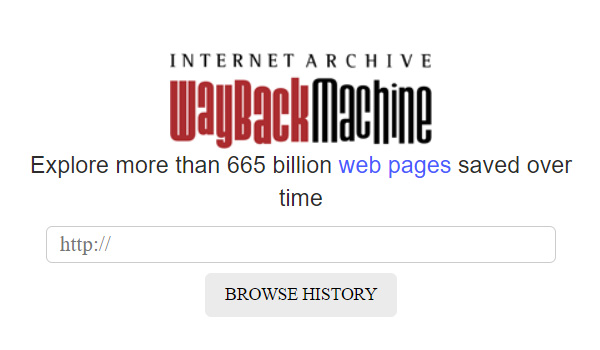
Do you know about the Wayback Machine?

It’s a website you can use to look at old versions of websites or websites that don’t exist anymore.

One of the questions I ask my clients is, “What websites do you like the design of?” If they say, “I liked the design of my old site, but it doesn’t exist anymore,” I use the Wayback Machine to look it up.

The Wayback Machine is part of the Internet Archive, a digital library with the mission of creating “universal access to all knowledge.” They provide free access to millions of digitized materials, including: websites, software, movies, games, and books.

They’re located in an old Christian Science church in San Francisco on the edge of the Presidio. Whenever I go to a restaurant on Clement Street and take a walk afterwards, I always have to stop by the Internet Archive.

The Internet Archive. It looks even cooler at night.

Some people think we already have the solutions to many of our problems, we’ve just lost the information. When we digitize our information and make it easy to search, we can find them again.

The Wayback Machine and the Internet Archive are so cool. Check them out.

https://archive.org

To Keep Your Passwords Safe, Use This

To Keep Your Passwords Safe, Use This

If you have a website, it’s critical to keep your login information in a safe place where you can access it easily.

But many of my clients don’t have a good method for managing their passwords.

One of them kept her passwords in her email, which is the WORST place you can keep them. Hackers can easily access them there.

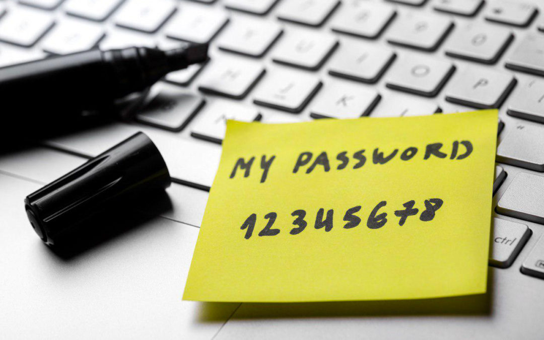
Many others have kept them on pieces of paper near their desks, but those can easily be misplaced.

It’s also not a good idea to use the same password for multiple accounts, because if one of them gets compromised, then all of your accounts are at risk.

So what should you do to keep track of your passwords and make sure they’re safe?

You need to get a password manager!

They’re free and easy to use, and they will make it much easier to log in to your accounts in the future. And, let’s face it, just logging in is half the battle when it comes to keeping your website updated.

I personally use 1Password, which is great, but I have the free version from a long time ago, and now they charge $3/month.

So I researched the best free password managers and multiple sources named Bitwarden as one of their favorites.

I tried it out and it only took a few minutes to download and figure out how to use.

So if you don’t have a password manager, download this right now!

Just take a few minutes to do it and use it to record your login information the next time you open an account.

In today’s world, having a password manager is critical to keeping your account information organized and safe.

You can do it!

https://bitwarden.com

Make Sure Your Website Has This

Make Sure Your Website Has This

Lately, I’ve been seeing this problem more and more.

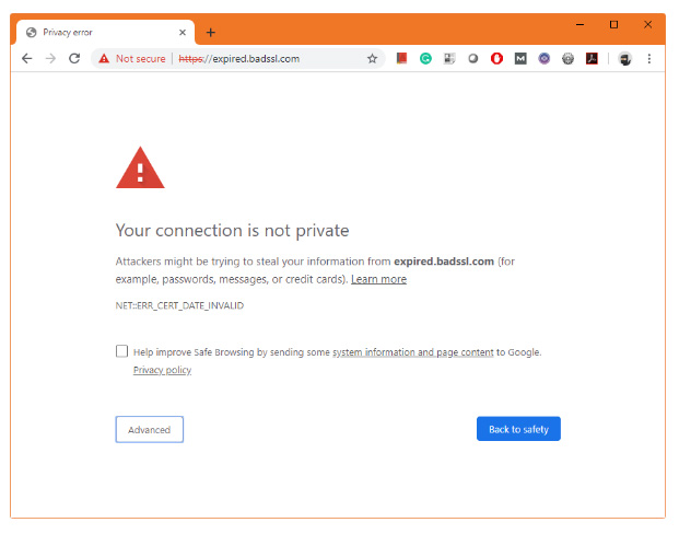
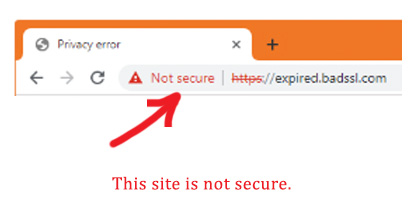
When I go to a website that’s not secure, I get redirected to a page with a warning message.

It usually says, “Your connection is not private,” and looks something like this.

In order to get to the site, I have to click the “Advanced” button several times and am cautioned each time that the site is not secure.

You can’t have this happening on your website.

If it is, you won’t get any visitors and your site will be ranked much lower in search results.

The problem is that many business owners don’t even know this is happening.

So how do you make sure that your website is secure and no one is getting a warning message?

Just do a simple check to see if you have an SSL certificate installed.

An SSL certificate encrypts the code on your site so that hackers can’t steal your customer’s information. In the past, SSL certificates were only required for e-commerce sites that people entered their credit card information on, but now they’re required for all sites.

Here’s how to determine if your site has an SSL certificate.

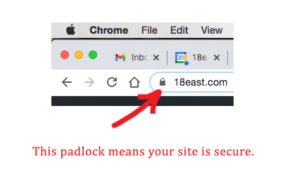
Go to your website and look in the address bar. To the left of your URL, you should see a padlock. That means there’s an SSL certificate installed on your site and your code is encrypted. Your site is secure, and no one will get a warning message when they try to visit it.

If your site does not have an SSL certificate, you will see a “Not Secure” message with a red triangle or a padlock with a slash through it. If that’s the case, you should contact your hosting provider right away and ask them to install an SSL certificate (They’re usually free with your hosting.) and to redirect your site to the HTTPS version.

So go to your website right now and look for a padlock to the left of your website address. If it’s there, congratulations, your site is secure. If it’s not, contact your web designer or hosting company right away and have them install an SSL certificate. It’s critical to making sure that customers can visit your site.

Good luck!

How Websites Are Like Conversations

How Websites Are Like Conversations

Do you know someone, perhaps a neighbor, who only talks about themselves, and never asks you anything about yourself?

At first, they might seem interesting, then they’re annoying, then, by the third or fourth time you see them, you start trying to look casual while hiding behind the nearest tree.

Don’t let your website be that neighbor.

A good website is interactive; it invites others to join the conversation, and makes them feel acknowledged and valued.

YouTube vs. Spotify
For example, let’s compare two popular music streaming websites, YouTube and Spotify.

Spotify allows users to listen to and “like” a variety of songs that they can add to a playlist.

YouTube also allows users to listen to and like songs, but in addition, it offers videos, song suggestions on the right, and, most importantly, a comments section, where you can post your thoughts about a song. These types of comments are fun to make and to read and they enhance the experience of being on the site, which is why I always choose YouTube over Spotify.

A website that doesn’t allow you to interact is annoying. For instance, Psychology Today has great articles on a variety of mental health issues, but many times I read them and think that I have something valuable to add, but then discover that they still don’t have a comments section, and I leave the site feeling frustrated.

An Excellent Example
Medium.com is the opposite. It offers articles on a variety of topics like self-help, pop science, and whatever other categories you choose. But one of the greatest things about it is their comments section. They even give you a profile page on which you can see what articles you liked, what comments you made, and how many likes they got. It makes you feel accomplished just for reading and commenting, and Medium gets free content from you in return. This is the most robust comments section I’ve ever seen, and I think it will be a major factor in their popularity.

So if you have a website, remember to make it interactive. This can be as easy as allowing comments on your blog or ratings on your products. When you give people a chance to join the conversation, they’ll feel listened to and valued, and that’s good for business.

The Best Way To Increase Your Website Traffic

The Best Way To Increase Your Website Traffic

Having a website is great, but it doesn’t mean much if you don’t get any traffic. It’s like having a grocery store on the moon. You could be the best grocery store in the universe, but it wouldn’t matter, because no one would be visiting.

You don’t want to spend money on a website that doesn’t get you business.

So if you’re hiring a web designer, make sure that your website will include basic SEO (search engine optimization). SEO is the process of getting traffic to a website. It involves researching your keywords (the words people search on when looking for a business like yours), and putting those keywords into your website text, links, and background code. That will give your site a much better chance of ranking highly in search results, but there’s something else you can do that will help even more.

How To Make Your Website Rank #1
The best way to increase your website traffic is to start a blog on your site. If you write a few articles that teach others about your product or service, you are giving customers something for free and gaining their trust (and Google’s), and you will rank higher in search results.

That is the best, most ethical way of doing SEO.

You see, Google doesn’t reveal the exact algorithms that will make a website rank number one, precisely because they don’t want business owners to be able to rank themselves number one. They want to show people searching on a subject the website they’re looking for, and making yourself an authority on a subject means you’ll be one of those sites.

The Ingenious Ways a Girlboss Used Social Media
Someone who used this technique very effectively is Sophia Amoruso, the founder of a young women’s clothing company called Nasty Gal. She started her business in her twenties and grew it to be worth millions.

Her book, Girlboss, is a fascinating account of the techniques she used to become successful, and I think the lessons are relevant to all business owners, so I’ll share them here.

Sophia started out by going to thrift stores around San Francisco and buying vintage band t-shirts and designer leather jackets, etc. She would buy them for next to nothing and then sell them for hundreds of dollars on her Ebay shop, Nasty Gal.

Ebay forbid sellers like her from collecting their customer’s emails or redirecting them to their own websites, but she ignored these policies and did it anyway. Eventually, she was kicked off of Ebay, but by that time, she had amassed a huge customer base.

She was extremely savvy in her use of social media. She spent time on MySpace (the old Facebook) each week friending the “it” girls in fashion, in order to get them to follow her back. She also became a master of photographing a clothing item so that the thumbnail size image was flattering and made people want to click on it.

But one of the main ways that she kept customers coming back to her website was by starting a blog on which she talked about all of the cool things she liked: bands, makeup, music festivals, etc. This blog created the vision of a lifestyle that young women wanted to imitate. She had customers coming to her website multiple times a day just to read her blog.

Eventually, she started selling her own clothing line in addition to her vintage items, and her company became worth millions.

The Lesson
So if you want to get more website traffic, start a blog on your site and write posts that teach potential customers something about your product/service, or that showcase your lifestyle/brand. This will keep people coming back to learn something new or to envision how cool their life could be (with your product)!

And when they’re already on your site, making a sale becomes much easier.

Good luck!

How To Choose the Best Domain Name

How To Choose the Best Domain Name

A domain name is the address for your website (ex. www.BetsysKetchup.com). If you don’t already own a domain name, and you’re looking for a web designer, I recommend that you consult with them first before buying one. Here are some basic tips to keep in mind.

1. A domain name should be short and unique.
Imagine saying your website address in a radio interview. People must be able to remember it and type it into their browser, so it should be short and unique.

Generic domain names don’t work. Pets.com, mortgage.com, and eToys.com are just a few examples of businesses that raised from 50 to 150 million dollars in funding, and miserably failed. Only proper names work. The biggest bookseller on the internet is Amazon.com, not books.com. The biggest auction website is eBay.com, not auctions.com.

2. It should always end with “.com,” unless you’re a nonprofit, in which case you can use “.org.”
People expect that most website addresses will end with “.com.” They will automatically type that ending, so if you choose an obscure ending like “.net” or “.biz,” etc., they might not even find your website. The only time that you should choose another ending is if you’re a nonprofit. Then “.org” is also acceptable.

To summarize, you should choose a domain name that is short and unique and ends with “.com” or “.org.”

Awful Stock Photos

Awful Stock Photos

One of the hardest parts of designing a website is finding great photos. I usually just try to take them myself, but if I can’t, I have to resort to hours of searching through stock photos to find even one that is beautiful and appropriate.

Here’s a classic example of a bad stock photo. A “businessman” doing a split jump over a field. I guess it’s supposed to convey success. “Buy (our product) and you’ll really get ahead,” is the message. But it’s just fake and absurd. Every element lacks subtlety. He’s super running in a super green field under a super blue sky with one cloud right in the middle. And what’s he doing in a field anyway? It’s all really bloodcurdling.

So don’t underestimate the time and skill it takes to find a good stock photo. This takes years off of web designer’s lives.

Drawing on the Right Side of the Brain

Drawing on the Right Side of the Brain

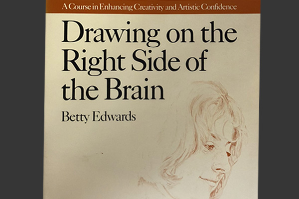
Drawing on the Right Side of the Brain is a book that can teach you how to draw. Author Betty Edwards was an art teacher who observed that most of her older students drew at the level of the average 10 or 11 year old. They drew cartoonish stick figures for a tree, house, or person, rather than the objects they were actually observing.

Then she started reading about studies of the left and right sides of the brain. Although we now know that people use both sides of their brain in a more fluid way, these basic ideas still hold true.

The left side of the brain is: verbal, symbolic, logical, linear, time-oriented, and prefers simple tasks. It’s the side that is valued in education, but also happens to be the side you must turn off in order to draw.

The right side of your brain is: visual, nonverbal, intuitive, nonjudgmental, non time-oriented, holistic, and prefers complicated tasks. If you learn how to turn on this side of your brain, you will automatically be able to draw more accurately, because you will be able to “see” what you’re observing, rather than drawing the oversimplified symbols that you’ve been taught to see. In addition, you’ll be learning about each of the objects that you draw, by taking the time to really observe them.

Read an excerpt from Drawing on the Right Side of the Brain.

How To Start a Business That Changes the World

How To Start a Business That Changes the World

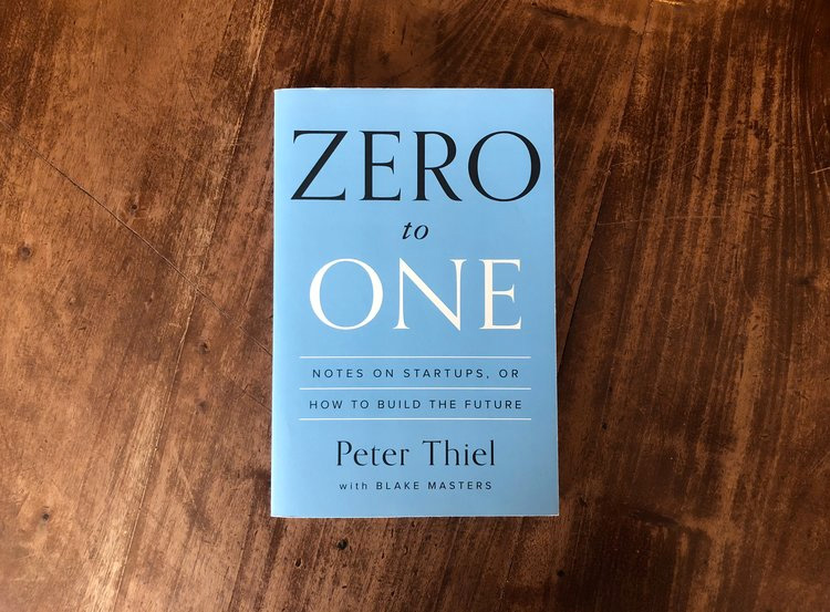
I’ve been reading a book called Zero to One by Peter Thiel, the founder of PayPal, and it’s inspired me to start thinking bigger, so I wanted to share his ideas here. Peter Thiel is a misogynist libertarian, who believes that women are ruining the world by voting for social welfare programs, so he’s not exactly my type, but he keeps his political opinions out of this book, and I have to admit that he does have some great ideas.

Here are his main ideas.

1) It’s very important for every person to think about the biggest problems the world is facing.

2) Then they should start a business that solves one of those problems.

3) It’s best to start a business that no one else has thought of, because then you will have no competition and can become very successful.

4) You should figure out what you are best at doing, and then do that thing only. You should not “diversify,” like we are all taught to do in school. The same goes for the business you start. Don’t do it halfheartedly. Put everything you’ve got into it.

These ideas are big, and I think that a lot of people would scoff at them, like they do all new ideas, but he goes on to explain that “experts” are not the only people capable of solving problems. Innovators come from all places. For example, in the 1940s, a schoolteacher in San Francisco developed a plan to restructure the city so that it would have more parks and more fresh water. He created a map with plans for two huge dams and freshwater lakes, among other things. He had no experience in that field, but, back then, people believed in big ideas and risk taking, so his plans were taken seriously by city officials. The army even built a small scale model that you can still see in Sausalito. Ultimately, his plans were rejected, but the lesson is that anyone is capable of problem solving and innovating.

The title Zero to One comes from the definition of technology. Technology isn’t just related to computers or science, it simply means, “whenever someone thinks of a much better way of doing something.” So, for example, the typewriter was one technology, and you can make many copies of a typewriter and distribute them, but that’s just going from one to many. But when someone invented the word processor, it was something entirely new, that made writing documents much easier than using a typewriter. That was going from Zero to One.

Peter Thiel does not just write about these ideas either. He’s very rich and has created a fund that pays college aged kids $100,000 to stay out of college for two years and just work on a project of their own choosing.

This is surely not just pure altruism on his part, as he is most likely forming a powerful network of innovators who will repay him many times over if their ideas work out.

Since reading this book, I’ve been thinking about the problems I see around me, and, instead of just feeling down about them, thinking about ways I could solve them (and make money at the same time).

For instance, on a road trip, my boyfriend and I went into a 7-11 to buy a bottled water, which I hardly ever do because water bottled in plastic is a terrible pollutant. So I looked for water in cardboard instead. But there wasn’t any besides coconut water, which I was considering, until my boyfriend said, “that can cause diarrhea,” (in slightly different words). I thought, why can’t I start a company that bottles water in cardboard? (Although, ultimately, I just went to Starbucks and asked for a paper cup for tap water.)

Then I was driving home, and I saw the homeless man living on my street, who is constantly covered with his own waste and rummaging in garbage cans. I thought, there’s a city that put into effect a program called Housing First, which gave homeless people apartments, and rounded them up off the street and took them back home regularly. And it saved the city money! They found that giving people the housing that they needed was cheaper, because otherwise, they were calling emergency services, and being driven by ambulance and treated at the hospital, all of which is more expensive. I thought, how can I start that program here?

Even if you just start a blog that shares your ideas about a subject that you know very well, you can make the world a better place. For instance, I just discovered the Mr. Money Mustache blog. This is written by a guy who retired by the time he was 30, even though he and his wife were only making $60,000 each a year as computer programmers. They were simply very good at saving money and investing it in index funds. And even though I’ve read plenty of personal finance books like Rich Dad, Poor Dad and Your Money, Your Life, none of these ever got through to me like that blog. But Mr. Money Mustache could have said to himself, why should I write this, this subject has already been covered by many people? And my life would be the worse for it.

That’s why I’m grateful for this book. I believe that thinking bigger, trying to problem solve, and trying to change the world for the better could benefit all of us and create the world that we really want to live in. I hope you feel inspired by these ideas too.

Read an excerpt from Zero to One.

If You Have a Website, Do Not Lose Track of This

If You Have a Website, Do Not Lose Track of This

Many of my clients contact me for the first time when they need their website updated. However, when I ask them for their domain name and hosting information, they’ve lost track of it or their web designer never gave it to them in the first place. This is a big problem.

Your domain registrar is the company that registers your website address (ex. www.cathyscrafts.com). Your hosting provider is the company that provides space on a server for your website files, which allows people to view them. If you own a website, the information you must keep on file includes the names of your domain name and hosting companies, and the usernames and passwords you use to log in to your accounts. Without this information, a web designer cannot update your site.

The best way to keep track of your domain name and hosting information is to use a password management tool like Bitwarden. This is the safest way to manage all of your passwords.

101 Things to Learn in Art School

101 Things to Learn in Art School

101 Things to Learn in Art School is a book that examines the basic principles and ideas behind making art. Author Kit White is a New York based artist and art professor at Pratt Institute, who says he missed the conversations he had as an art student, and the exercise of going back to the beginning, asking first questions, and examining basic premises. Here are a few of them that I found interesting and thought also applied to web design.

2) Learn to draw.
Drawing is more than a tool for rendering and capturing likenesses. It is a language with its own syntax, grammar, and urgency. Learning to draw is about learning to see. (Here is an excellent book that can teach you how to draw, Drawing on the Right Side of the Brain, by Betty Edwards.)

5) A drawing (or a painting, photograph, and so on) is first and foremost an expression of its medium.
The medium is the artwork’s first identity. It is secondarily about what it depicts. Form shapes content.

6) Composition is the foundation of image making.
It is the spatial relationship between all of the parts in an image and determines its look, feel, and meaning.

14) All images are abstractions.
Even photographs. They are never the thing pictured.

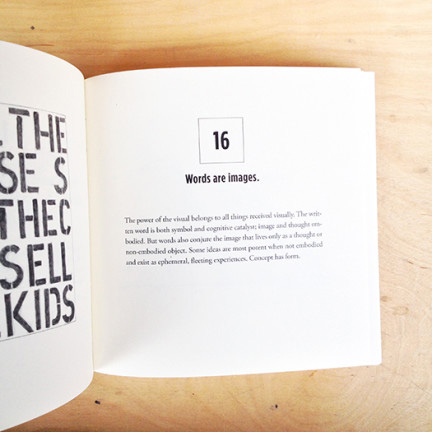
16) Words are images.
The power of the visual belongs to all things received visually.

24) All art is political.
The choices you make in what you describe, and the medium you choose, will always be subject to an interpretation that has political implications.

30) For every hour of making, spend an hour looking and thinking.
Good work reveals itself slowly. It is a good idea to step away from what you are doing at regular intervals.

44) The human brain is hardwired for pattern recognition.
The brain looks for what it knows.

51) Learn the basic principles of color.
There are three primary colors: red, blue, and yellow. They are the building blocks of all other colors. The secondary colors are violet (blue and red), green (blue and yellow), and orange (red and yellow). They are composed by the equal mixture of two primaries. All other colors are referred to as tertiary, because they are a mixture of a primary and a secondary color.

69) Color is not neutral.
It has an emotional component. Certain colors have specific associations and induce certain responses. Learn what they are.

89) Eliminate the nonessential.
Every work of art should contain whatever it needs to fulfill its descriptive objective, but nothing more. Successful images have no dead spaces or inactive parts.

93) Cultivate your idiosyncrasies.
Every hand, every eye, every brain comes with its own built-in distortions. These distortions represent your personal signature, your slant on the world … do not be afraid to embrace them.

96) Document your work.
Digital photography makes this easy. It is necessary to have a good record of images for school, galleries, your own history, and also as a source from which to draw ideas for future work.

Go to Kit White’s website.

Read a free version of 101 Things to Learn in Art School.

How To Get Inspiration for Any Project

How To Get Inspiration for Any Project

In the book Steal Like an Artist, author Austin Kleon writes about how to get inspiration for any project. His theory is that every idea is stolen; there are no new ones; everyone is just imitating something they’ve already seen. So when you’re starting a new project and need inspiration, just find great examples of what you’re trying to create and steal (imitate) them.

The second step is to subtract everything you dislike about your inspiration. “Creativity is subtraction” is an idea he repeats often. In doing so, you will come up with something unique.

I use these techniques myself whenever I’m designing a website. I start out by searching for websites for that type of business, and I also keep a bookmark of “cool websites” to refer to later on. Although I copy elements from other designs, I always find myself subtracting the elements I dislike, and adding others that I like, changing them to suit the information and graphics for my project, so in the end the website is totally unique.

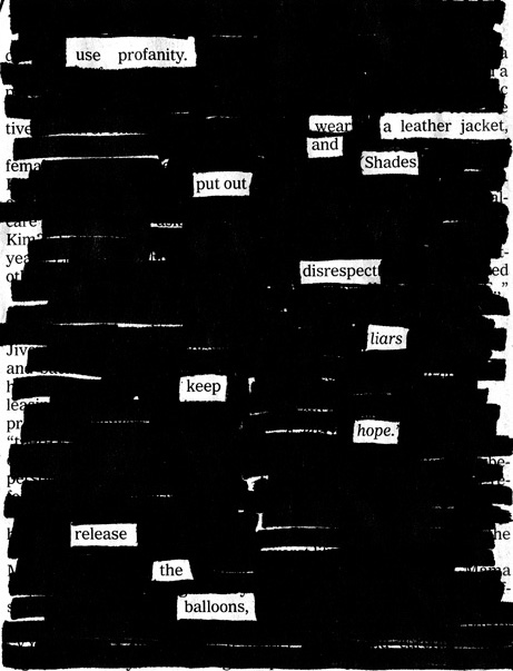
Kleon also has other interesting ideas. He offers the service of “drawing events,” or coming to an event and sketching the people, places, ideas, and conversations. He also wrote the book, Newspaper Blackout, in which he took newspaper articles and crossed out most of the words, leaving only a few that formed poems. Here’s one of my favorites, “How To Be Cool.”