
101 Things to Learn in Art School is a book that examines the basic principles and ideas behind making art. Author Kit White is a New York based artist and art professor at Pratt Institute, who says he missed the conversations he had as an art student, and the exercise of going back to the beginning, asking first questions, and examining basic premises. Here are a few of them that I found interesting and thought also applied to web design.
2) Learn to draw.
Drawing is more than a tool for rendering and capturing likenesses. It is a language with its own syntax, grammar, and urgency. Learning to draw is about learning to see. (Here is an excellent book that can teach you how to draw, Drawing on the Right Side of the Brain, by Betty Edwards.)
5) A drawing (or a painting, photograph, and so on) is first and foremost an expression of its medium.
The medium is the artwork’s first identity. It is secondarily about what it depicts. Form shapes content.
6) Composition is the foundation of image making.
It is the spatial relationship between all of the parts in an image and determines its look, feel, and meaning.
14) All images are abstractions.
Even photographs. They are never the thing pictured.
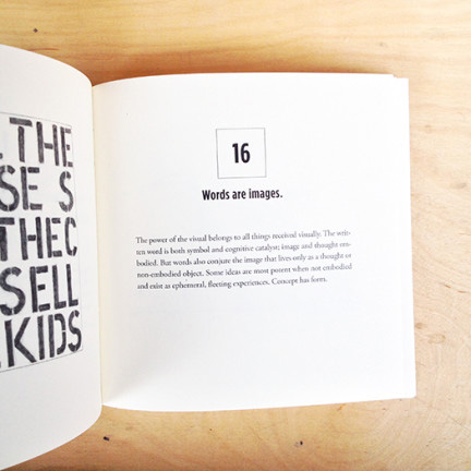
16) Words are images.
The power of the visual belongs to all things received visually.
24) All art is political.
The choices you make in what you describe, and the medium you choose, will always be subject to an interpretation that has political implications.
30) For every hour of making, spend an hour looking and thinking.
Good work reveals itself slowly. It is a good idea to step away from what you are doing at regular intervals.
44) The human brain is hardwired for pattern recognition.
The brain looks for what it knows.
51) Learn the basic principles of color.
There are three primary colors: red, blue, and yellow. They are the building blocks of all other colors. The secondary colors are purple (blue and red), green (blue and yellow), and orange (red and yellow). They are composed by the equal mixture of two primaries. All other colors are referred to as tertiary, because they are a mixture of a primary and a secondary color.
69) Color is not neutral.
It has an emotional component. Certain colors have specific associations and induce certain responses. Learn what they are.
89) Eliminate the nonessential.
Every work of art should contain whatever it needs to fulfill its descriptive objective, but nothing more. Successful images have no dead spaces or inactive parts.
93) Cultivate your idiosyncrasies.
Every hand, every eye, every brain comes with its own built-in distortions. These distortions represent your personal signature, your slant on the world … do not be afraid to embrace them.
96) Document your work.
Digital photography makes this easy. It is necessary to have a good record of images for school, galleries, your own history, and also as a source from which to draw ideas for future work.